Naming, branding, brand strategy and the design system for the producer of medical equipment — NeuroSafe
The description:
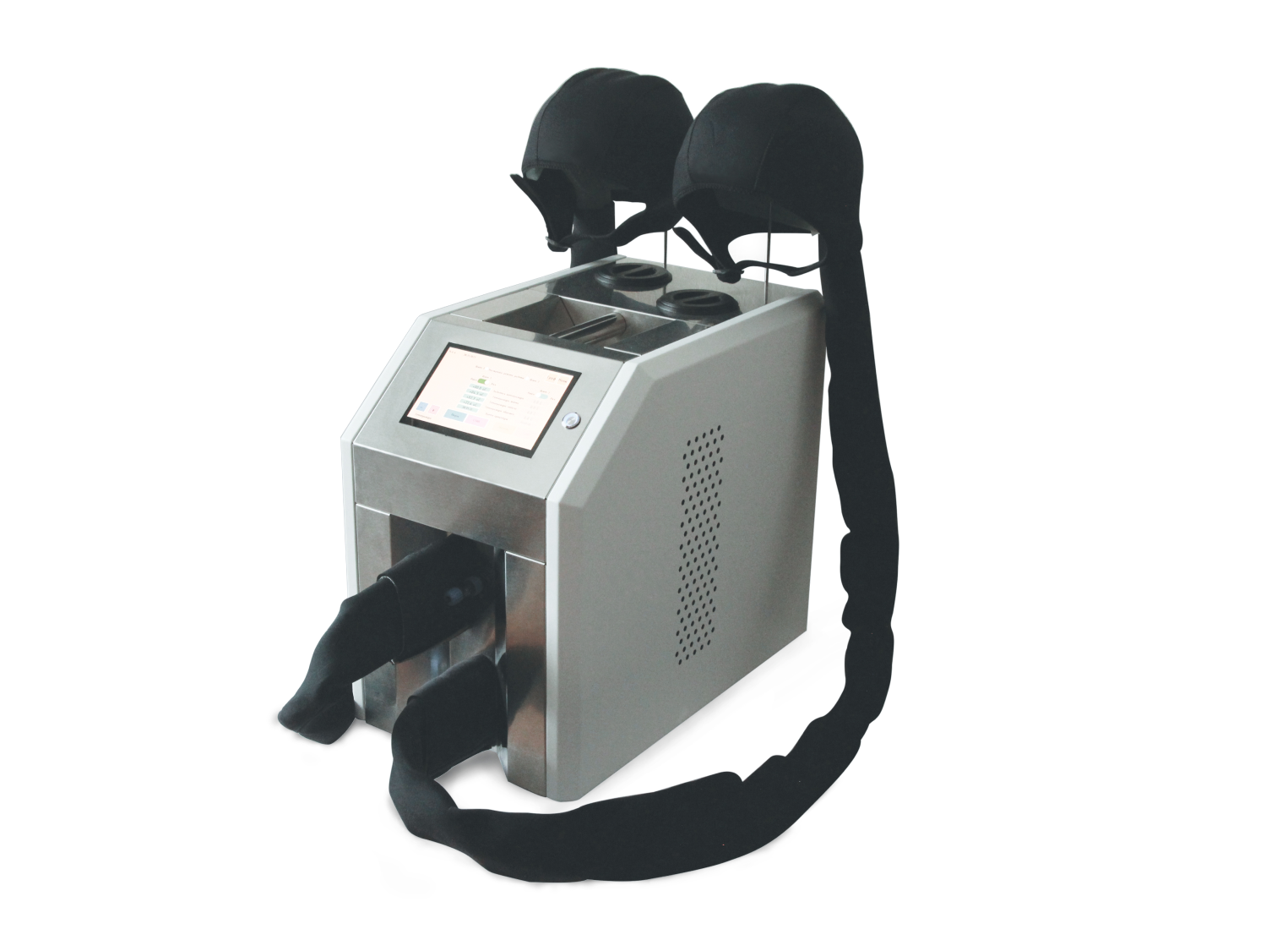
Naming, branding, brand strategy and the design system for the producer of medical equipment — NeuroSafe. Neurosafe is the developer of medical equipment for therapeutic cooling of the brain. This technology and equipment protect neurons and neural connections from the destruction. As a result method helps to reduce mortality and disability rates, improves the quality of life and increases chances for active longevity.
The task:
The objective for branding was to visualise the principle of method and the potential effect of the technology. Also, the company wanted an image, which creates sense of expertise, safety and reliability and translates friendliness and caring nature of the brand.

The target audience
Hospital CEOs, key medical specialists, medical opinion leaders, government representatives. Conservative, highly educated, with a very high level of scientific expertise (MDs, PhDs, professors, ministers).
Implications for the design: the design should be adequately strict and clear. Facts and functionality are predominant to the creativity. Tone of voice should be formal, polite, respectful.


Metaphors:
Care and protection, balance, neural network, soothing cold.

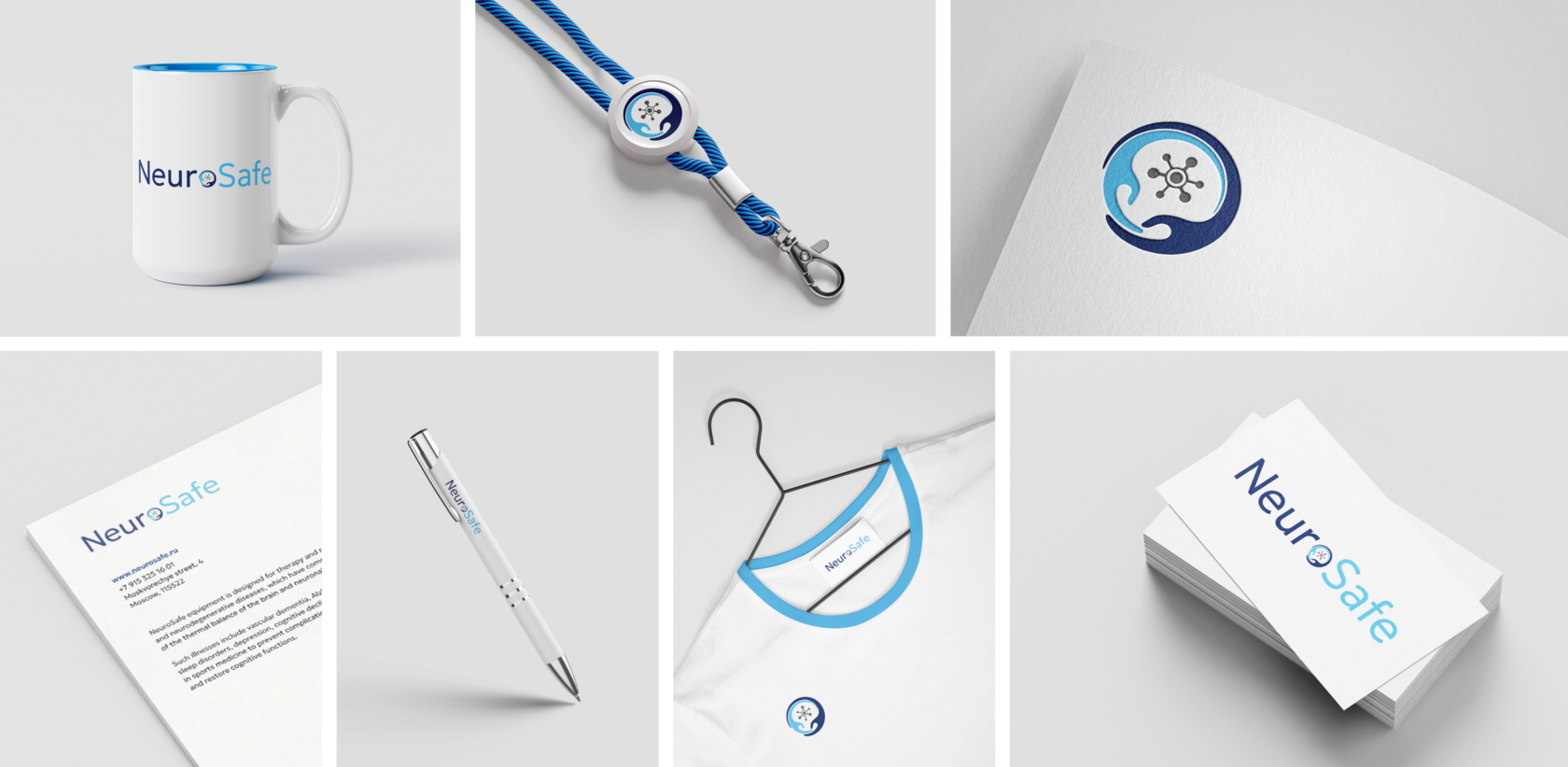
Logo is inspired by the neuro-protective properties of NeuroSafe equipment, which are represented by caring hands, surrounding neuron
Geometry of lines of the logotype resonate with the geometry of the wordmarks
Symmetrically balanced wordmarks and usage of dark blue and light blue symbolise healthy thermal balance of the brain
This logo was not built using the grid since it includes emotional component — hands of care and protection





Typographics
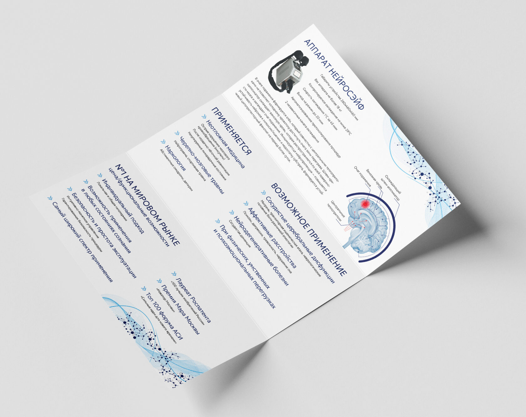
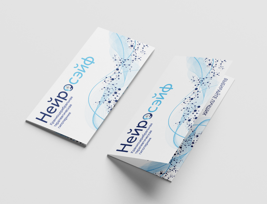
Graphic elements
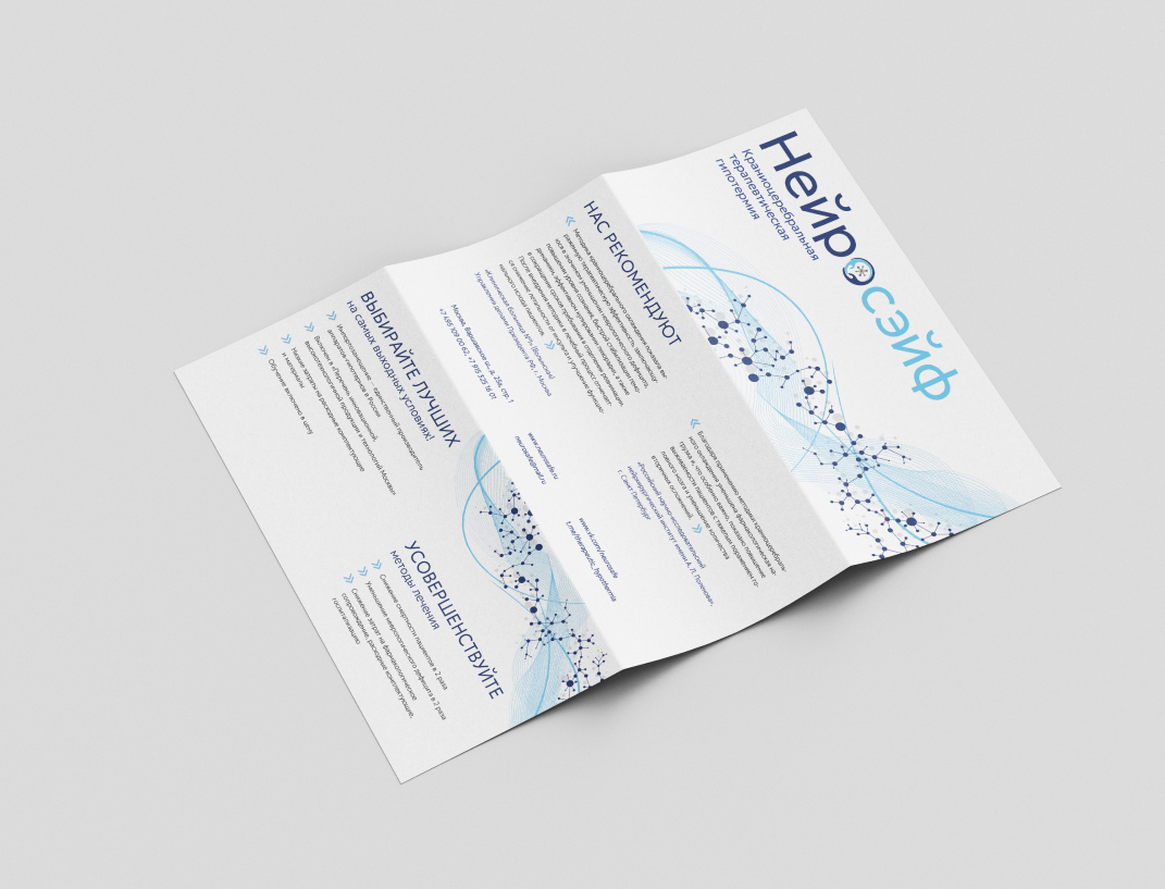
Circles and lines in random order — abstract neural network
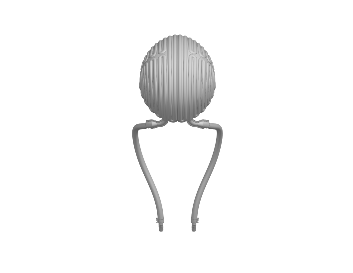
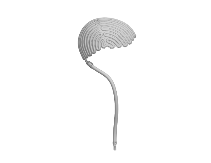
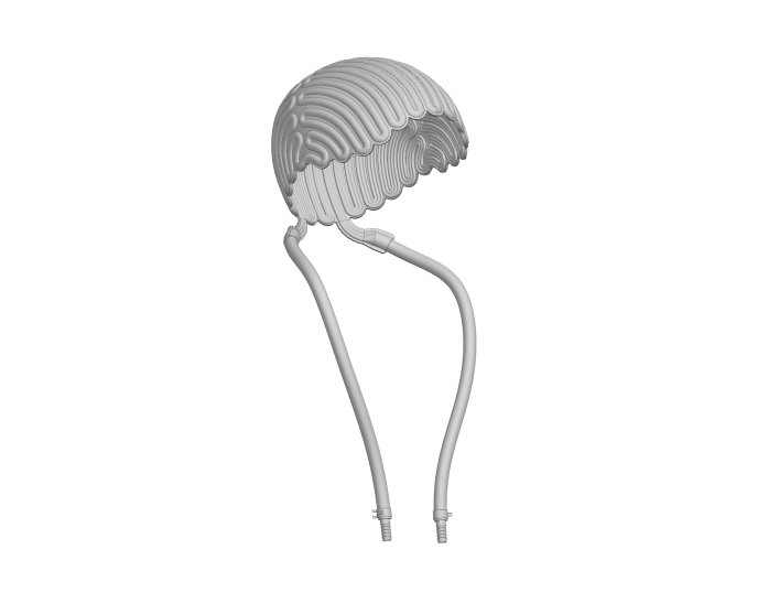
Pattern of lines — abstract flow of coolant through the helmet (unique feature of the equipment)



Icons
Following the idea of logo and graphic elements, foundation for icon development has been laid.
AI photo session
The brand has to talk about sensitive, distressing topics (death, trauma, disability). Therefore, key visual images should be chosen with care; in most cases, real patients and doctors cannot appear in marketing materials for ethical reasons.
Therefore, a series of photographs with a consistent character — doctor was created to design materials for digital channels of communication.
Six portraits of the same character were generated to maximize accurate and consistent generation


The character was generated in different poses with different facial expressions, which are appropriate to the theme of the project.

Images of a character in a hospital setting were developed

Since the project is innovative, images of the character in futuristic settings were generated
The result: a photo shoot generated in neural network now allows the brand to create SMM materials in a single, recognizable style


SMM
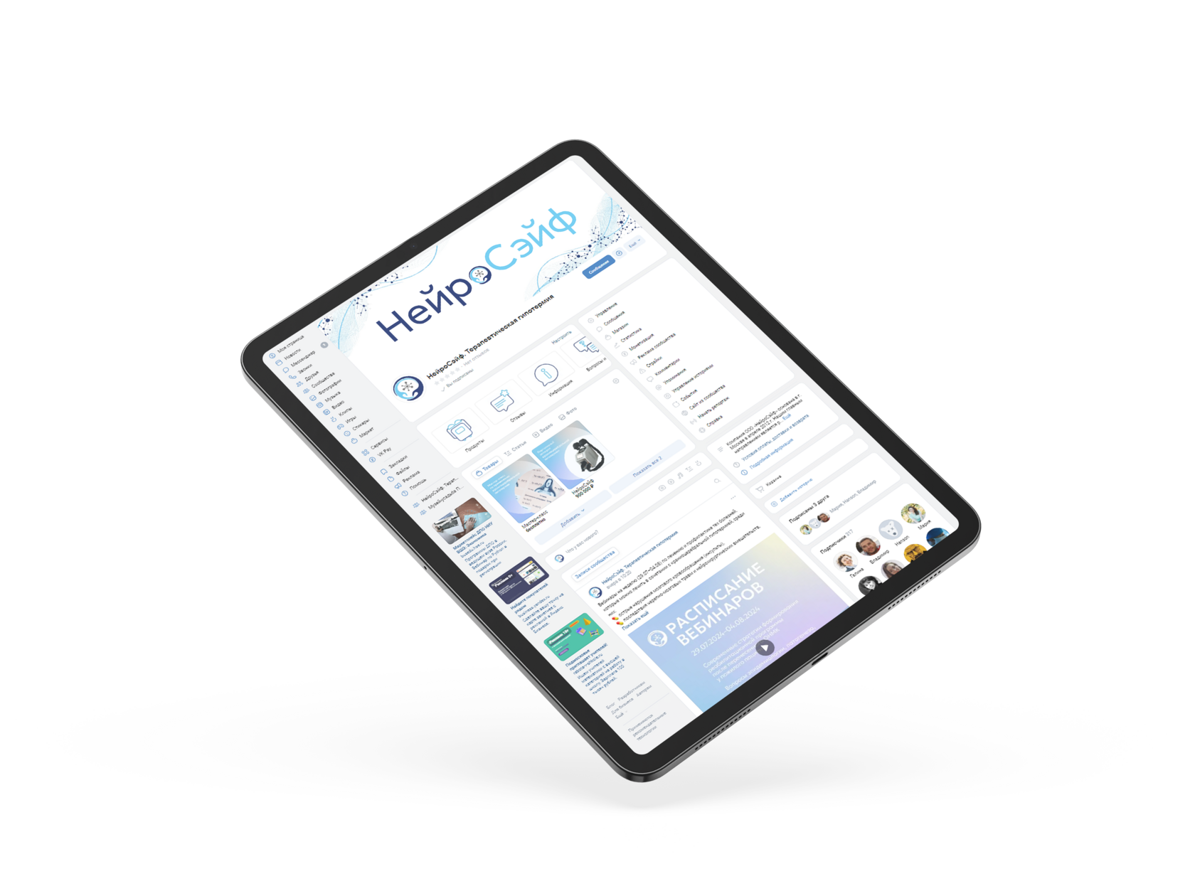
In accordance with the idea of the logo and graphic elements, the foundation for the design of materials for social networks is laid.



Presentations
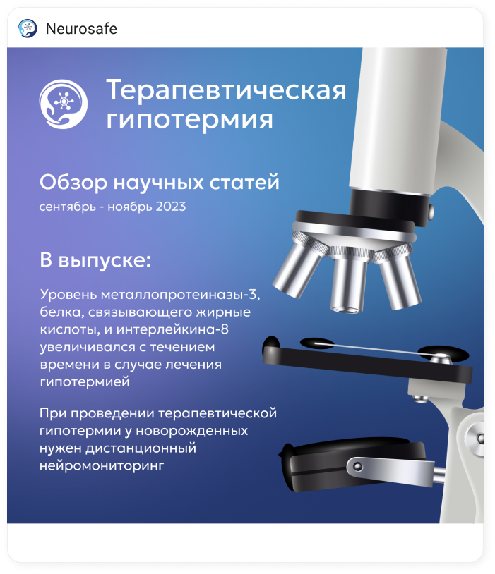
Presentations were developed to promote the method and the equipment for therapeutic hypothermia induction at public events.


Stickers
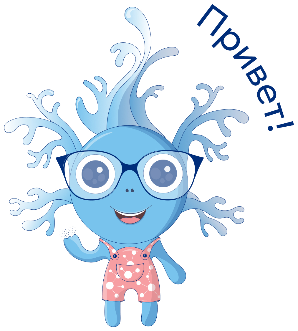
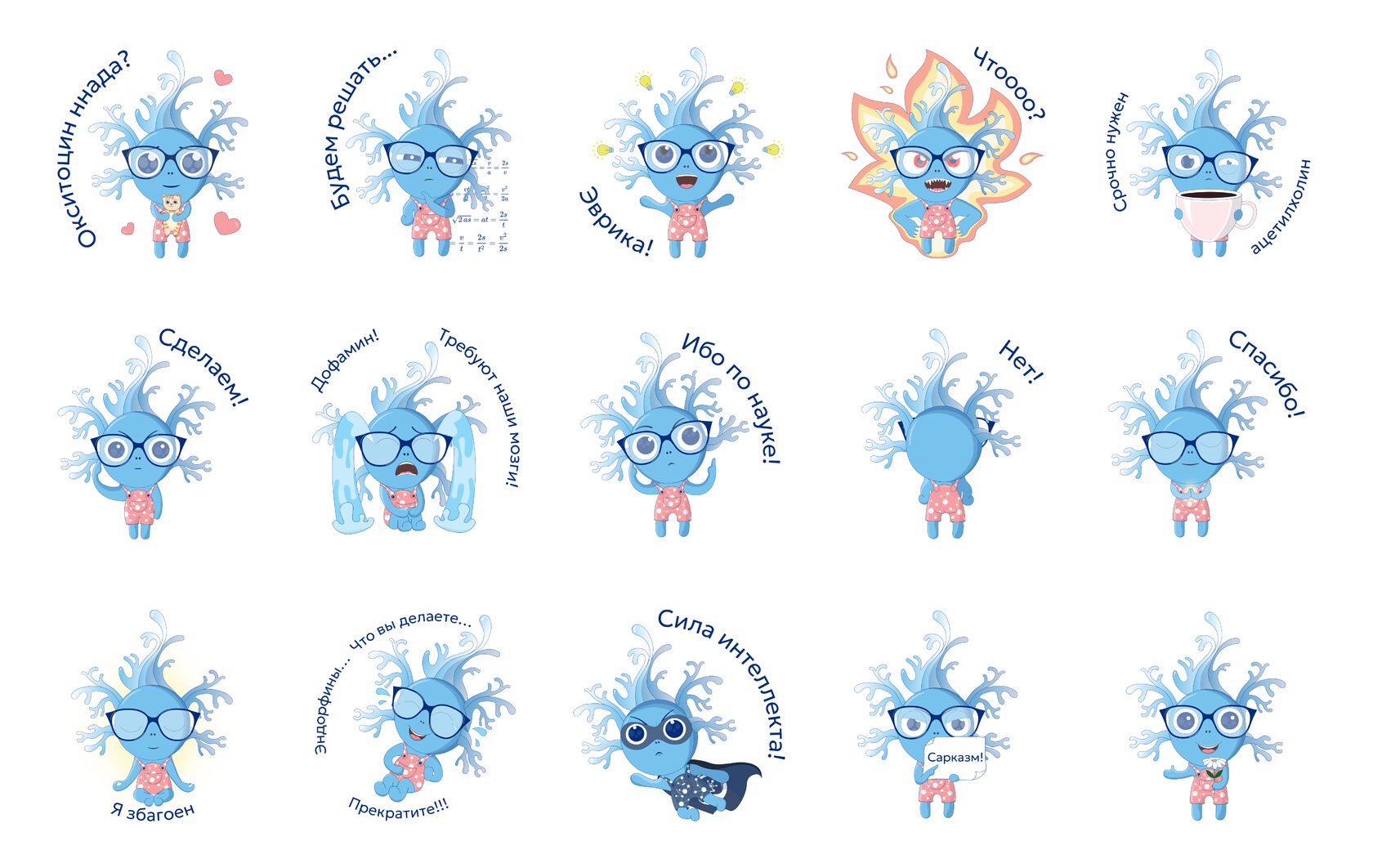
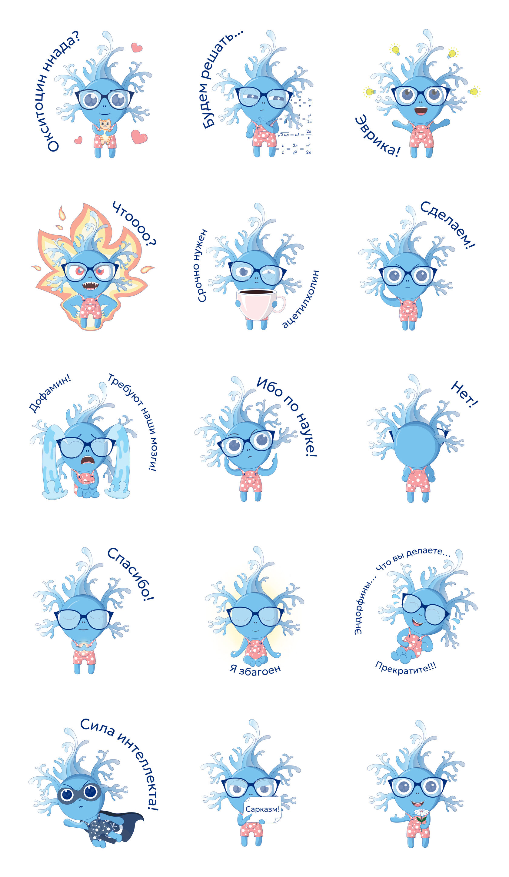
With introduction of portable model, which can be used at home, company considers the possibility to expand target audiences. Brand mascot — neuron Neuronika has been created. It keeps the scientific nature and tone of voice and adds to the communication user-friendliness and kind humor.
Download stickers for telegram

