

Identity and corporate style for the xvi spa and wellness festival — TOPSPAFEST
Description:
Topspafest is an international festival for the spa and wellness industry professionals. It is held annually since 2009 worldwide (Russia, Turkey, Thailand, Azerbaijan).
Task:
To develop a vibrant corporate identity for the 2024 festival, which will be held in two locations: in Moscow and Istra. The theme of the festival is "I choose life". The design should reflect hope, choice in favor of life in any circumstances. Brand style must help the participants to get inspiration, strength, energy and discover new horizons. It is also necessary to show the great versatility and diversity of the festival, to emphasize the location of the venue.


Breath — the origin of life


Target audience
Regular and potential participants of the festival: masseurs, osteopaths, cosmetologists, rehabilitation therapists, fitness instructors, bath attendants and parmeisters, managers, psychologists, business experts, manufacturers and distributors of cosmetics and equipment.
Insights: these are mainly representatives of tactile, assisting professions, people who contribute to the discovery of external and internal harmony. Therefore visual communication should be positive, gentle/caring, filled with warm power and energy.

Metaphors
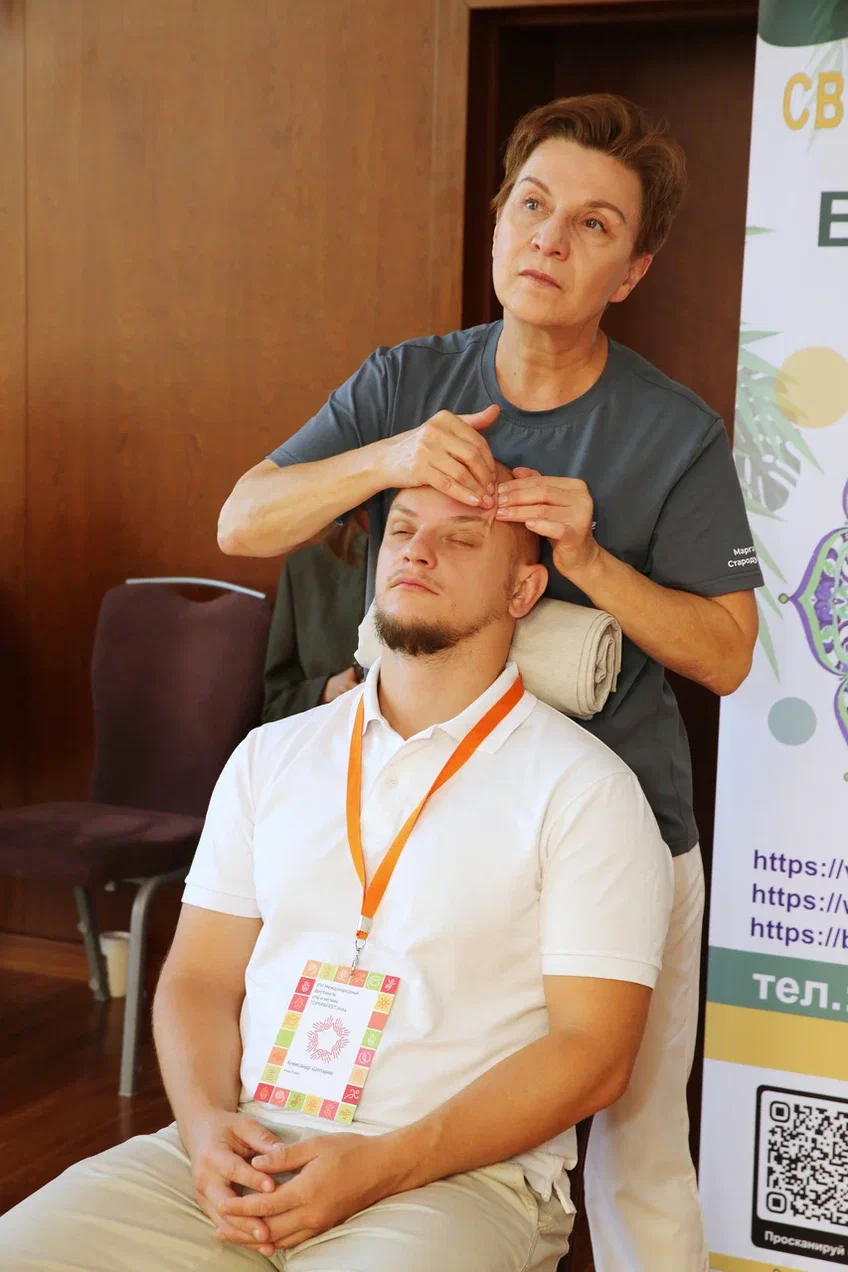
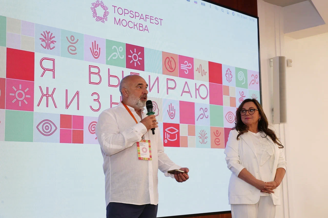
Hands — a symbol of the main "working tool" of the festival’s participants, the Kremlin Star — a symbol of the location of the event, she shapeof circle of the spreading hands — a symbol of unity and equality, interlacing of smooth curls, often found in Mezen painting, — a symbol of folk art traditions.
Following the customer's request, the logo of the festival 2024 is built similarly to the permanent logo of the brand
Cut line endings replicate the typography of the descriptor (Topspafest Moscow)
The logo is built with the grid


Additional logos
In addition to the main logo, several additional logos in a similar style were designed for the events of the festival
Topspaface Award
Annual marathon


Massage championship
Directors
Teachers




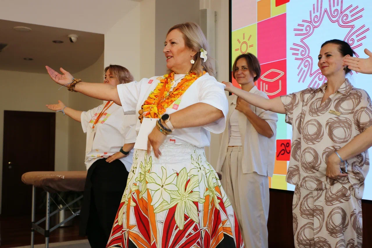
Movement — the foundation of life


Brand colors
Spring
Delicate palette symbolizing the awakening of life. It was used for design of the website launched in spring 2024.
Autumn
A more vibrant palette symbolizing the bright blooms and fruits of life for printed products which are intended for the duration of the festival in autmn 2024.



Linear objects
Corporate linear objects are built in the style of the logo lines. They represent areas of festival activities and programs.

Yoga
Tree planting ceremony
Breathing practices
Dance classes
Presentations
Voice practices
New skills
Excursions
Massage
Marathon
Director
Activities
outdoors
Training
School
Sauna


Pattern
Created from linear objects on a background of squares in brand colors.


Fonts
For headlines

Asymmetry in slopes of the inner line of the font adds headlines vigor, movement, liveliness.
For texts

Moreover, Raleway rhymes with accent in the curves of ovals and half-ovals, in the ratio of height to width of lowercase characters.
The geometric style echoes the geometry of the logo, pattern.
The font is chosen in contrast to display font. It is minimalistic, possesses balanced proportions, is easily readable.

Photostyle
Photos associated with the mood and theme of the festival «I Choose Life» were selected and generated on the Internet. Key images: nature, tactility, spa, growth, healthy lifestyle.
Color correction (equalized brightness / adjusted warm color palette) of photos was performed to create harmonious, cohesive images.


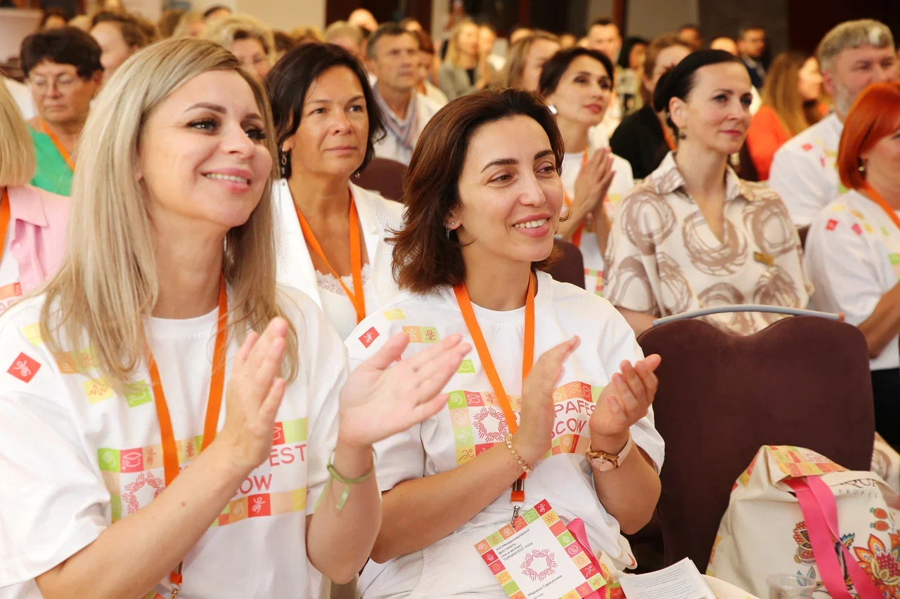
Touch — the joy of life


Print materials
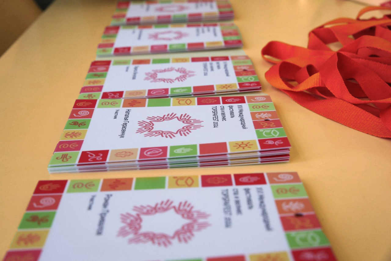
14 modifications of diplomas for the award of the festival, marathon, championship were designed with the modular grid.


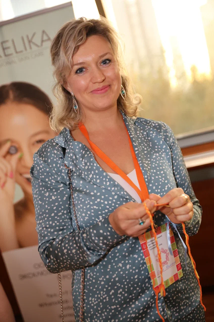
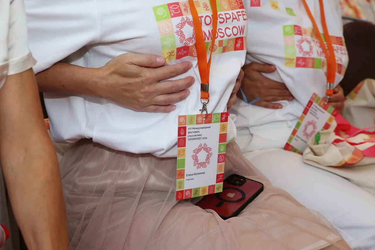
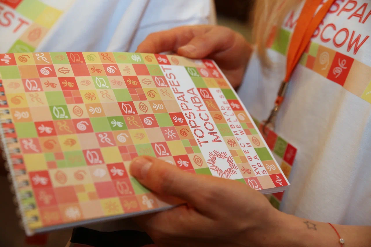
Notepad cover (A6), name id badges for more than 140 event participants, press wall (4×2.5 m), poster-calendar (80×100 cm) for September.


Merch
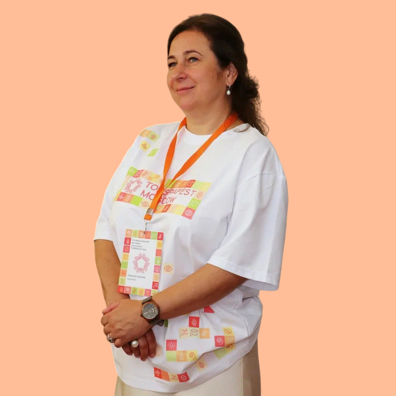
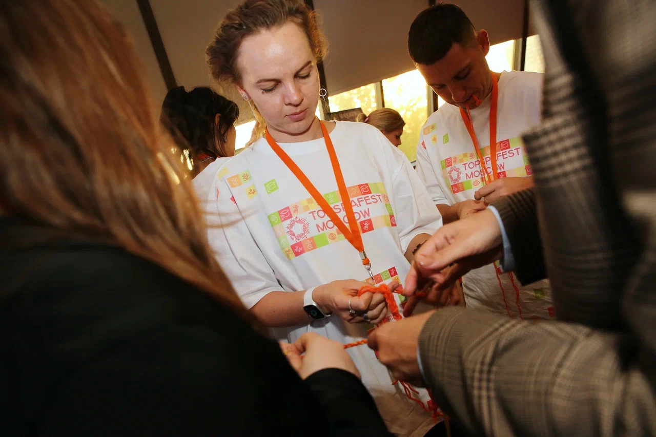
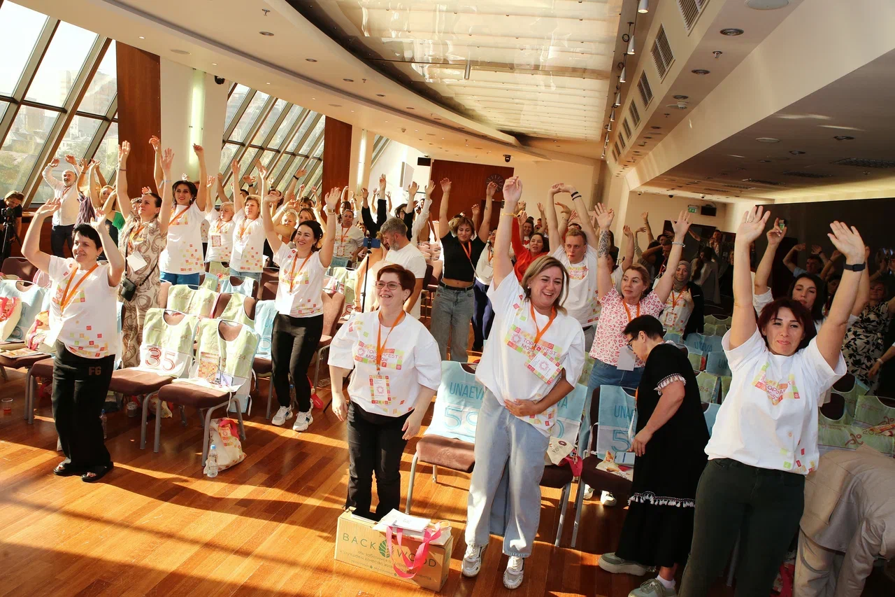
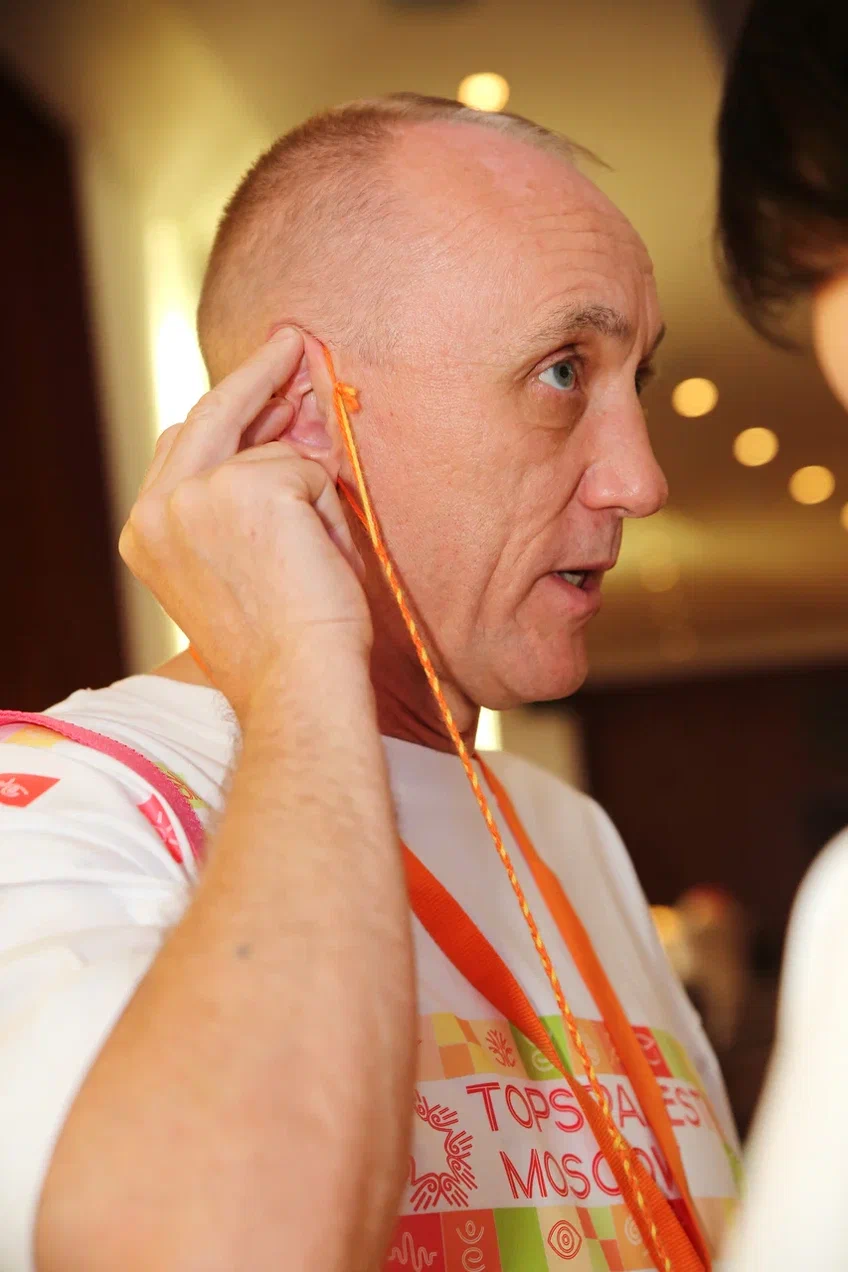
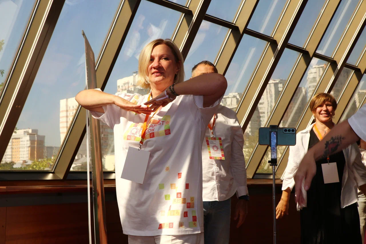
A merch kit for the festival participants was developed: branded T-shirt, bag, badge, pen.


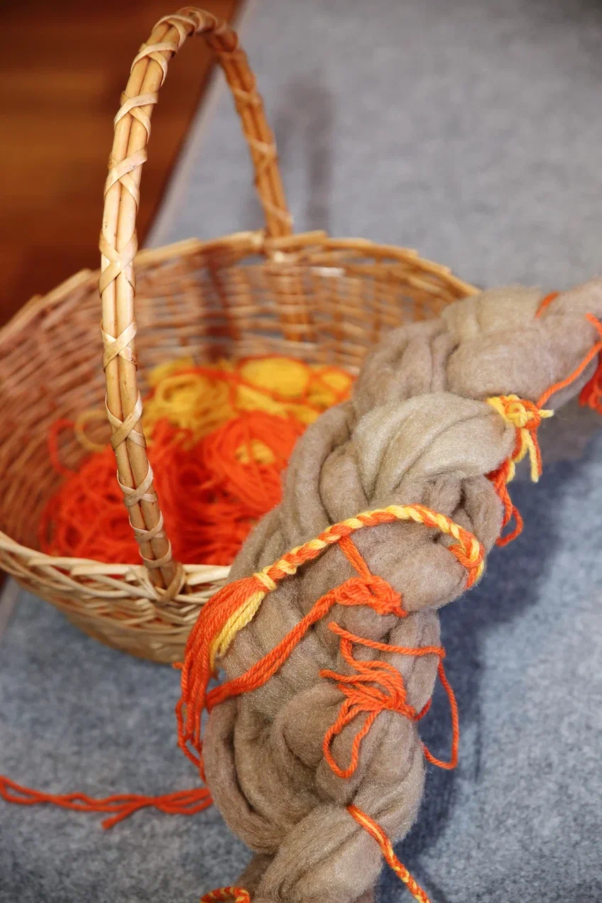
Labor — the salt of life


Guideline
The 60+ page guidline was created. It describes the visual components of the corporate identity and includes recommendatiuons for their application.

The guideline is available online.
Result
The project is successfully implemented. The customer is satisfied. The review will be published here upon the arrival.
Ludmila Syrchenko
"I have chosen Galina Repina as the designer of the annual project out of 12 presentations of other designers and I am very happy with my choice. We worked on full cycle design for the annual festival for the spa industry: from creating the style of the year to merch and print materials. Galina captured the philosophy of the event and reflected it very beautifully in the guidebook. Her work was clear, structured, creative, responsible. She created a landing page with animation elements, which was very user-friendly and exceeded our expectations. All the media materials were sorted in the database for the convenience of other users. All agreements and deadlines were met. I received quality feedback and support. I sincerely hope for future cooperation".
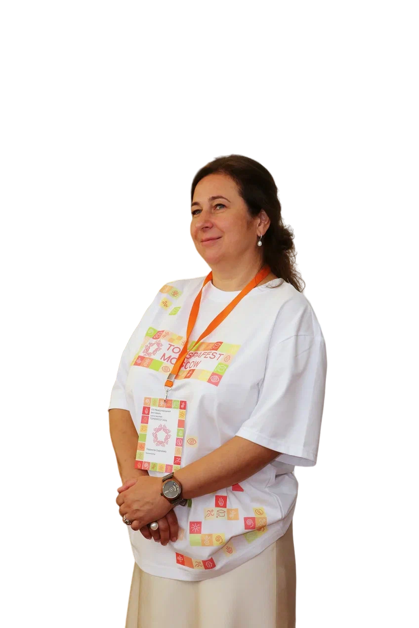
Organiser of XVI International Festival «Topspafest»
